Wednesday 17 December 2008

Seven Communications

Seven Communications

The Big Picture

My Portfolio Website


www.7comms.co.uk

Seven Communications are a multimedia company based in Stockport. They specialize in web design, graphics design, touch screen kiosks and corporate identity. The company is made up of a small team of experts who work together to produce a high standard of professional work for their clients that include companies such as Cadburys, University of Hull, NHS and Stockport Council.

I was attracted to the Seven Communications mainly because of the web design that they produce. 'The Big Picture' is the latest website they have created and the style and composition is really eye catching. This piece was created to capture students attention whilst still being informative to teachers. I think the way they have created the piece suits the targets audience perfectly as the positive white space and the layout of the type, images and videos makes it easy to read and navigate around the site. The website was a massive success and a quote on the website describes how the website got a record number of hits.

"The website got a record number of hits yesterday and that is fantastic.... The website is getting a lot of 'love'- people like the films and the overall layout- it's made a big difference." (www.7comms.co.uk/projects_bigpicture01.php)

I am really interested in meeting with Steve Bower, the Managing Director of the company because it would be interesting to find out what the progress of working along side a client is like. I would like to ask questions such as, 'How many times do you meet up with the client to discuss the website and how often does the client see the website in progress'

I feel that my portfolio website is quite similar in style to the 'The Big Picture' website. I have also used lots of white space and the layout is simple, which makes navigating around the site very easy. I tend to use a minimilst approach to my work so the viewer can get straight to the point without becoming confused. 

I emailed Steve originally last year and he said he'd help out with anything I needed in the 3rd year. I took on this opportunity and emailed him asking him if he would like to see my work in progress so I could gain some feedback and advice. He emailed me back saying he would like to meet me in the New Year, which I think would be really useful as he could give me some tips and advice on my final major project as-well as my previous work such as my portfolio website, my self-directed project and my competition brief.

Here is the email below

From: aaron nicholas (aaronnicholas@live.com)
Sent: 04 December 2008, 13:51
To: steve@7comms.co.uk
Subject: Information regarding your work

Hi, I emailed you a while ago regarding your work. I have moved into my 3rd of my degree at Stockport College in Multimedia Design.

At the moment I am creating a self-directed project and also producing a live competition brief with YCN. I was wondering if possible, if there is a chance to show you my work in progress to gain some feedback. This would be a great help to improve my work and gain some advice.

Thank you for your time,
                                 Aaron Nicholas


From: Stever Bower (steve@7comms.co.uk)
Sent: 15 December 2008, 09:09
To: 'aaron nicholas' (aaronnicholas@live.com)

Hi Aaron

Give me a call on number below in the New Year, & I would be interested in seeing your work.

Regards

Steve


Tuesday 16 December 2008

MK12


www.mk12.com

MK12 are a motion graphics company formed in 2000 in Kansas City. The company is made up of 5 friends who all attended Kansas City Art Institute. In the short time the company have been in existence, they have an impressive client base which includes Mastercard, Levis, MTV, Budweiser, Diesel and Adidas.

Although MK12 mainly focus mainly on motion graphics, they also cover different areas of design such as video and graphics. A piece they created for Adidas is my favorite piece by them which is an advertisement for adidas basketball.

The Adidas basketball advertisement is of a basketball player doing various tricks and shots from different angles and positions. It caught my attention because of the simplistic background and lighting with just the basketball player and net being visible. The way the player moves and leaves a trail of himself behind him is a technique that I really admire and would love the chance to use in some work of my own. As I am really interested in the motion graphics side of design, I will do further research into similar techniques and styles and try and use this in my own work.


Tuesday 2 December 2008

Danny Yount


www.dannyyount.com
www.prologue.com

Danny Yount is a self-taught designer who is todays top main title designer for television and film. Yount is seen as the modern day Saul Bass who had a huge influence on his own title sequences. In an interview for the magazine, Computer Arts, Yount describes how Bass influenced him to create the Kiss Kiss Bang Bang title sequence.

"Tell us about your credit sequence for Kiss Kiss Bang Bang. Did Saul Bass influence the design?", "Very much so, After reading the script, which is based partly on fictitious crime novels of the 60s, I thought it would be best to take the viewer to that time period. Bass titles ruled back then, so it was appropriate. I wanted to keep the titles unpredictable." (www.computerarts.com)

Kiss Kiss Bang Bang is one of my favorite title sequences because of simplistic and minimalist style to the sequence. I love the subtle camera angles and the way growing elements appear throughout. I also think audio match up with the visuals perfectly that makes the sequence more complete.

Curious George is another title sequence that Danny Yount has created. The style is very similar to Kiss Kiss Bang Bang, but this one uses much more hand-drawn illustrations which I think works really well. I really like how the camera angle pans across the screen revealing different hand drawn pictures and the artists and directors names from the film.

Danny Yount has created many other title sequences for films such as Spiderman 2 and 3, Iron Man, The Incredible Hulk, Dawn of the Dead and Superman Returns. He also worked for MTV, ESPN and Sci Fi Channel.

Rock n Rolla I must admit is my favorite title sequence by Danny Yount and maybe of all time. The sequence captures the rough and edgy theme of the film in the short sequence that uses a very abstract style. The illustrations that have been used for each character are really influential and I would love to create something similar myself. 

I will continue to look at Danny Yount's over the next year as I approach my final major project. Motion Graphics is a big inspiration for me and I would love the chance to work in this area of design.


Tuesday 25 November 2008

Tom Hunter


www.tomhunter.com

Tom Hunter is a British photography who was born in Dorset in 1965. Hunter graduated from the London College of Printing with a BA First Class Honours in 1994. Since then Hunter lives and works in London and has had his photographs shown in exhibitions around the world.

I came across the work of Tom Hunter, whilst watching 'The Culture Show' on BBC1. The show explained how many artists were campaigning to raise £50 million to buy the original 'Titians Diana and Actaeon' for the nation.

Tom Hunter's idea was to recreate the original painting and photograph a modern version to help raise money to buy the original. Kim Cattrall, David O'Mer and art history students were used as the characters in the photograph.

I have included this in my blog because I think the idea of recreating something from the past is something that interested me. Although I feel that the original of anything cannot be beaten, I still like to look at recreations and look at things from a modern angle.

Wednesday 22 October 2008

Roberto de Vicq de Cumptich


www.devicq.com

Roberto de Vicq de Cumptich is a type-based illustrator and graphic designer who was born in Rio De Janeiro, Brazil. In 1982, de Cumptich moved to New York and studied art and design at the Pratt Institute earning a MFA. Nowadays de Cumptich works as a Senior creative director at Harper Collins.

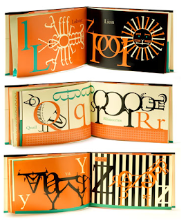
I came across de Cumptich whist I was researching for my self-directed project. My self-directed project was a self-portrait moving image piece that is made up of typography. De Cumptich 'Bembo Zoo' was a huge influence as he makes up animals just out of typography, this is the idea that I used as I made my face out of different sized typography.

Bembo Zoo was de Cumptich's children's book debut, although many adults and students have bought the book for themselves. De Cumptich produces a abecedary picture book that has an animal represent each letter of the alphabet using just typography. "Bembo has long been one of the most popular typefaces for continuos reading. But never before in the history of typography has its versatility been better displayed than in Robert de Vicq de Cumptich 'Bembo's Zoo'. In his first book for children, de Cumptich has created an abecedary of animals made entirely from Bembo letter-forms and punctuaction marks nothing else. And, you know, the conceit works." (www.devicq.com)

De Cumptich's Bembo Zoo has been huge influence so far on my multimedia course. I think that his clean aesthetic, limited colour palette and minimalist style will influence me for years to come because this is the style that I prefer to work in. 


Gillean Blease


Gillian Blease is an illustrator who was our first guest lecturer at Stockport College in the third year of my degree. Gillian came across as quite a laid back and friendly person who was very direct and straight to the point with her story of how she became the fantastic illustrator she is today. Throughout the lecture she was very modest and explained how alot of her work was through 'being at the right place at the right time'. However I felt her amazing illustrations and pure talent were the reasons behind getting the jobs she has done.

Gillian began her artistic career studying a foundation course at MMU before studying fine art at Newcastle University for 4 years. However, she found herself more as an illustrator and had always been influenced by illustrators such as Terry Frost, Paul Rand and Andy Warhol. She also explained how spending 6 weeks in Japan shortly after her studying has always been a huge inspiration in her work.

You can clearly identify the similarities in the work of Gillian and her influences, as she focuses her designs on colour, shape and line using a minimalist approach. Gillian tends to use lots of empty space in which she explained, "Empty space emphasizes the drama of the main subject". I feel that the minimalist approach using lots of empty space creates a positive feeling for her illustrations.

Over the years Gillian has built up a very impressive client base including Barclays Banks and The Guardian newspaper, where she worked on a weekly project creating over 150 illustrations in 3 years. She described how working to deadlines and having to come up with different ideas each week was an invaluable experience.

As a Multimedia student, I thoroughly enjoyed the lecture, however because of my moving image background I would love to see her work morphed into animations or anything moving image.

On the whole, I found the lecture very entertaining and educational and her work has made me think about trying to come up with my own style so I can be recognized as an individual designer.

Friday 17 October 2008

Joe Zammit-Lucia


www.jzlimages.com

Joe Zammit-Lucia is a professional environmental photographer based in the UK and the USA. He was born in Malta and has been involved in photography since the age of 16. Since then his photographs have been on shown around the world, including New York, Miami and London. 

Joe Zammit-Lucia uses the basic formal elements of photography and produces stunning photographs using a minimalist style. Joe combines the basics of line, shape, form and space to give each photograph a unique style. He uses lots of positive space by removing each subject from its original background and replaces it with a black background. By doing this, the composition of the photograph makes the viewers eye lead directly to each animal.

The way that Joe Zammit-Lucia crops and positions his photographs has a major impact on the emotions of each animal. For example on the photograph of the Giraffe above, he crops the image so that the viewer can only see half of the Giraffes face. Personally, I feel that this gives the animal its own identity because the line, shape and form lead your eye to the Giraffes eye, which looks as though it is thinking about something.

I came across Joe Zammit-Lucia, whilst studying a part-time photography course, and have been inspired ever since. The way he uses lights and shadows emphasizes the emotions and feelings of the endangered animals. I found a quote on Joe's website that describes the way he feels when photographing each animal, "Portraits celebrating the animal as individual not as mere specimen on species" (www.jzlimages.com) I feel that this is a strong quote from Joe, as it shows how he feels about each animal, he feels that every animal has its own identity and he shows this with the photographs he takes.

I feel that Joe Zammit-Lucia can have an influence on my work in the future, as I really enjoy the minimalist approach and using black and white. He has influenced me to try and capture my own photographs in a similar style but also look at different area's of design and try and incorporate these ideas and technique in my own work. 

Friday 3 October 2008

Richard Morrison


www.th1ng.com
www.figproductions.com

Richard Morrison is one of Britains greatest title sequence directors, creating more than 100 feature film title sequences over the last 30 years. Morrison explains in a documentary how his title sequences have been hugely influenced by Saul Baus and explains how working with Morris Bindler in his early career on the title sequence for James Bond helped him develop new skills and techniques.

I am a huge admirer of the work of Richard Morrison because of his unique style of title sequences such as the original Batman, The Golden Compass, Vantage Point and Sweeney Todd. Sweeney Todd is the title sequence that excites me the most because of the combination of live action and CGI animation, that builds up the suspense and tension of the film. 

Morrison worked on the title sequence for Sweeney Todd with a company called th1ng, which is a leading animation and mixed media company who create TV idents, Commercials and Title Sequences. I feel this title sequence fits into my Multimedia path perfectly, as like my course, it uses many different techniques and mediums to create the abstract sequence. The sequence uses dark and  shadowy scenes to create an eerie and suspenseful narrative that builds up the tension and mood of the film. The way the bloody sequence is edited, it drags the audience in and sets them up for the rest of the film. 

The title sequence uses lots of sources from the film such as showing the barbers chair, the meat pies and the blood. The idea of this is to give the audience a preview of what they are about to see in the film, which I think builds the atmosphere. I also admire the composition of the sequence, with the blood being the main focus. This makes the audience follow the movement of the blood, from the blood drips on the window, to the blood between the clogs and continues towards the oven. Another area I am intrigued by is the way the blood transforms from CGI animation to live action as it flows towards the sewers, I think this is done so that the transition between the title sequence and the film is alot more subtle. 

On the whole, Richard Morrisons Sweeney Todd title sequence has been a huge inspiration. Although I have not used any of the ideas and techniques used in the title sequence as of yet, the idea of mixing CGI and live action is an area I will look into in the future. I also think that the idea of building the tension and suspense with the title sequence to create the mood of the film is a technique i could use in the future.  


Wednesday 24 September 2008

Toast Concept


www.toastconcept.com

Toast Concept, are a design company based in Lyon, France. They were formed in 2007 and cover a broad range of design such as Graphic Design, Product Design, Motion Graphics, 3D Animation and Web Design. As-well as Posters, Logos, Flyers and Montages.

I came across this company, whilst researching into Audio and Visuals for my self directed project. I particularly like the 3D animation they produced called Speakers because the visuals and audio is in sync with each other and I really like the way the speakers are created in an abstract form. I also like the use of colour that they have used and the smooth movements of the camera. This animation can be seen in the video below. This is something that I am looking into for my self directed piece and has been a huge influence for my research and development.

I like the way all the work uses simple aesthetics which gives a clean and professional look to the whole portfolio. I also really like the Graphic Design work they have produced because they all use the theme of having a white background that makes the abstract shapes and colours stand out alot more. I have posted some examples of their Graphic Design work.


Gary Fernandez


www.garyfernandez.net

Although I am a Multimedia Designer, I am still very interested in other areas of art and design such as Graphic Design, Illustration and photography. I really like the design work of Gary Fernandez who is a freelance Illustrator, Art Director and Graphic Designer from Madrid, Spain who now lives and works in Vancouver. I came across Gary's work after seeing his illustrations on the front cover of Septembers issue of Computer Arts.

Inside the magazine, it shows more work from Gary and also has a short interview with him. In the interview Gary explains how he comes up with ideas for his work. "What are your creative influences?" he answers, "The outside- urban or forests. That s where the actions happens. Inside, the things from the outside change in surrealist way. I listen to music all day. It helps me push what i have inside."  

You can clearly see how these influences have inspired his work, especially the outside world, which you can see in his work with wildlife, plant and trees appearing throughout his way. I also think that Gary's work could have been influenced by the work of Bridget Riley, with the shapes, colours and shades that he uses. Although Bridget Riley tended to use Black and White optical illusions in her work, i can see some similarities. 

Gary has an impressive portfolio and has worked for large companies such as Coca-Cola, Corona, Camel, Volkswagen and Nokia. I think these companies have used Gary because his unique illustrations catches the eye of many people with his use of colours, shapes and abstract forms. However, Gary can also work in a way to suit a certain client, such as his work for Coca-Cola, which is very different to his other style of illustrations. He uses alot of white space with the main focus being on the Coca-Cola bottle and the swirls coming out of it. I think Gary must of been told to emphasize on the bottle or he would of created his abstract wildlife that you see in his other illustrations, which would of took the focus away from the brand. 

I have chosen to put this illustrators work into my research because I think that looking into different areas of design can only help you become a more creative person. His work has influenced me to want to try and create my own illustrations and maybe move them into an animated after effects piece.