
Wednesday, 22 October 2008

Roberto de Vicq de Cumptich


www.devicq.com

Roberto de Vicq de Cumptich is a type-based illustrator and graphic designer who was born in Rio De Janeiro, Brazil. In 1982, de Cumptich moved to New York and studied art and design at the Pratt Institute earning a MFA. Nowadays de Cumptich works as a Senior creative director at Harper Collins.

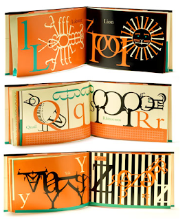
I came across de Cumptich whist I was researching for my self-directed project. My self-directed project was a self-portrait moving image piece that is made up of typography. De Cumptich 'Bembo Zoo' was a huge influence as he makes up animals just out of typography, this is the idea that I used as I made my face out of different sized typography.

Bembo Zoo was de Cumptich's children's book debut, although many adults and students have bought the book for themselves. De Cumptich produces a abecedary picture book that has an animal represent each letter of the alphabet using just typography. "Bembo has long been one of the most popular typefaces for continuos reading. But never before in the history of typography has its versatility been better displayed than in Robert de Vicq de Cumptich 'Bembo's Zoo'. In his first book for children, de Cumptich has created an abecedary of animals made entirely from Bembo letter-forms and punctuaction marks nothing else. And, you know, the conceit works." (www.devicq.com)

De Cumptich's Bembo Zoo has been huge influence so far on my multimedia course. I think that his clean aesthetic, limited colour palette and minimalist style will influence me for years to come because this is the style that I prefer to work in. 


Gillean Blease


Gillian Blease is an illustrator who was our first guest lecturer at Stockport College in the third year of my degree. Gillian came across as quite a laid back and friendly person who was very direct and straight to the point with her story of how she became the fantastic illustrator she is today. Throughout the lecture she was very modest and explained how alot of her work was through 'being at the right place at the right time'. However I felt her amazing illustrations and pure talent were the reasons behind getting the jobs she has done.

Gillian began her artistic career studying a foundation course at MMU before studying fine art at Newcastle University for 4 years. However, she found herself more as an illustrator and had always been influenced by illustrators such as Terry Frost, Paul Rand and Andy Warhol. She also explained how spending 6 weeks in Japan shortly after her studying has always been a huge inspiration in her work.

You can clearly identify the similarities in the work of Gillian and her influences, as she focuses her designs on colour, shape and line using a minimalist approach. Gillian tends to use lots of empty space in which she explained, "Empty space emphasizes the drama of the main subject". I feel that the minimalist approach using lots of empty space creates a positive feeling for her illustrations.

Over the years Gillian has built up a very impressive client base including Barclays Banks and The Guardian newspaper, where she worked on a weekly project creating over 150 illustrations in 3 years. She described how working to deadlines and having to come up with different ideas each week was an invaluable experience.

As a Multimedia student, I thoroughly enjoyed the lecture, however because of my moving image background I would love to see her work morphed into animations or anything moving image.

On the whole, I found the lecture very entertaining and educational and her work has made me think about trying to come up with my own style so I can be recognized as an individual designer.