Thursday, 2 April 2009

Aeiko


www.aeiko.net

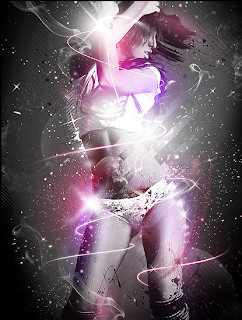
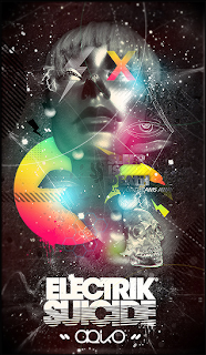
Aeiko is the online portfolio of graphic designer, Pete Harrison. Pete is freelance designer who also works in web design, typography and brand identity as well as graphic design. Pete graduated with a BSC Honours degree in Medialab Arts and now works under the creative name of Aeiko. Since graduating he has built up an impressive client list including Dolice and Gabanna, Peugeot, BMW, Sky, Natwest and Fall Out Boy.

I came across Aeiko as I was browsing through Computer Arts and was amazed by his abstract print based based work. He tends to use photographs in his work with unusual shapes, lines and colours surrounding the main focus. I love the composition and layout of all his work and would love to try and create something similar myself because I find his work outstanding.

Tuesday, 31 March 2009

Hans Brinker Budget Hotel Campaign


www.hans-brinker.com

Hans Brinker Budget Hostel is situated in the heart of Amsterdam. I went on a University trip there in my first year of my degree and loved the place. It was cheap and cheerful but had a great time with my mates.

However the Hans Brinker has a very unusual way of advertising the hostel. We all know that all hostels are dull and dirty but most hostels try and make the place look much cleaner and presentable through advertising. Not the Hans Brinker. Their advertising over the years show over the top images and illustrations that show that the hostel is proud to be dirty.

Their unusual way of advertising gets people talking and makes people curious of what the hostel is actually like. I have found some mixed quotes here on a website...

www.frederiksamuel.com/blog/2006/12/hans-brinker-budget-hotel.html

Deanna Says:

"I don't understand how this sells the hotel at all. Who wants to stay at a cheap hotel where everything is broken? And what does 'Unique Design' have to do with anything? This is terrible.

Although I will say that subtract the fact that it is an advertsising trying to sell something and failing miserably- the layout, colors and images are great".

Zed Says:

"Hi, this ad made me smile, and upon reading the negative comments, it made me smile more, in that it was willing to alienate a portion of the demographic (and possibly customers!) so as not to be condescending- I;m sure they could have "fixed" the ad by clarifying that their furniture and hospitality services aren't actually broken, and added contrasting reference images to show exactly what they're satirizing, but that sort of the audience- hand-holding is far more insulting that helpful. if it fails, at least it fails honorably, Good on them."

I have to agree with the second comment made by Zed, I think the advertisement is genius and when me and my mates looked at the posters before we went we all laughed and couldn't wait to get there and see what it's like. As the hostel is mainly aimed at student like ourselves, I think the advertisements work perfectly.

Welcome To Cloud


www.welcometocloud.com

Welcome To Cloud is the online portfolio of Pierre Nguyen, a 25 year old Graphic Designer from France. Pierre is based in Paris and his illustrated graphic design are both beautiful and unique.

There is not much information about Pierre on the internet but I just find his work remarkable. The way he uses composition, layout, colours and shapes is completely original. His work is like a collage but arranged in an unusual way with objects, colours, shapes and lines being mixed together.

He tends to use lots of black and white with shades of colour on certain shapes and objects. His work has been a huge inspiration for my final major project, as I want to create my own collage style animation using similar layouts and colours. As soon as I seen his work I was amazed, but have always wanted it to be animated in some way. Maybe just subtle movements with music in the background. I will experiment with this style and layout with my final major project and maybe email him my work when I have finished to show him how he's influenced me.

Monday, 30 March 2009

Soemone


www.soemone.com

Soemone is the digital portfolio of Doucin Pierre, a 25 year old freelance graphic designer from Paris, France. He also works on illustrations for prints and web-based images and also creates websites himself. On his website it describes that,

"After about ten years dedicated to the culture of grafiti, Soemone now works with digital format and has developed a personal and dynamic graphic universe. Open to any form of expression, Soemone's work is in the perpetual evolution. He multiplies every experience and has mastered every a unique style and technique of present day design".

Throughout his work you can clearly see his graffiti background with all his images being very abstract and colourful. His work is very unique and he tends to distort each images by adding shapes, lines and objects to them or subtracted them from his image.

As my channel ident will have lots of celebrities on it, this style of distorting an image could be a good idea to represent them on my ident. This is something that I will experiment with.

Brand Nu


www.brandnu.co.uk

Brand Nu is the creative name for the online portfolio of Radim Malinic. Brand Nu create Illustrations, Graphic Design, Typography and Album Artwork for clients such as O2, BBC, Sky Sports, Ministry Of Sound and Orange amongst others.

I came across Brand Nu in the latest edition of Computer Arts and loved the colourful and abstract work that was in their. His work is similar to Welcome To Cloud that I have also been looking at but I feel Brand Nu's work is more commercial and client based driven whilst Welcome To Clouds seems to be his own style completely.

Although I love Brand Nu's work, as a Multimedia student I cant help but want to see the work being animated onto a channel ident, an advertisement or any sort of moving image piece.